Buttons
Buttons are interactive elements that users can click or tap to perform a specific action, like submitting a response, committing a change, or moving to the next step. To create an intuitive and effective user experience, the right use of buttons is essential.
Principles
The GROW design system provides a set of principles that are fundamental in the process of creating and using buttons:
Clarity
Clear labeling: Use concise, descriptive labels to clearly communicate the button's action.
Visual distinction: Ensure buttons stand out with appropriate contrast, color, and typography.
Affordance: Design buttons to look clickable through shading, borders, and consistent styling.
Feedback
Visual feedback: Provide immediate visual changes (color, shadow, animation) to indicate interaction.
Loading indicators: Use loading indicators or disable buttons for actions that take time to process.
Error and success messages: Display clear messages for successful actions or errors.
Consistency
Uniform design language: Maintain a consistent style for buttons, including color, shape, size, and typography.
Consistent placement: Place buttons in familiar and expected locations to reduce cognitive load.
Interaction patterns: Use consistent interaction patterns for similar actions to improve predictability for the user.
Button types
Each button variant fulfills a specific function and is designed and intended to communicate this to the user. It is therefore very important that the implementation of the different variants is consistent across products so that the correct actions are signaled.
Primary button
Primary buttons are used for the main call to action on the page: submitting a response, applying a change, or moving on to the next step. Primary buttons should only appear once per screen. This does not apply to the application header, modal dialog, or sidebar.
Secondary button
The secondary button is for secondary actions on any page. Secondary buttons are used only in combination with a primary button. As part of a pair, the secondary button's function is to perform the negative action of the task.
Ghost button
The ghost button is often used for smaller or frequently occurring interactions on a website. For instance, it is commonly used in product teasers or news teasers. The ghost button does not serve as the primary call-to-action, but rather displays tertiary links to other pages.
States
Button states describe different states of an element. These states are used to communicate with the user - they give the user feedback on the status of the interaction. The status is therefore expressed via the visual state of a button:
1. Default
2. Hover
3. Disabled
Hierarchy
In order to optimize the user experience, hierarchy plays a major role in the usage of buttons.
Single, high-prominence button
To encourage the successful completion of an action, a page or layout should contain a single, high-prominent button to indicate that other buttons are less important in the hierarchy. Most of the attention will be drawn to this prominent button such as a primary button.
Multiple, mixed-prominence buttons
Using multiple buttons only works when a high-prominence button is paired with a low-prominence button such as a secondary button or a ghost button. They should only appear as pair when their relationship to each other is defined by a common action.
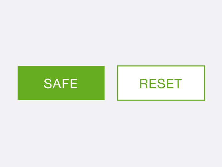
If multiple buttons are used, always use two buttons with different importance and hierarchy next to each other
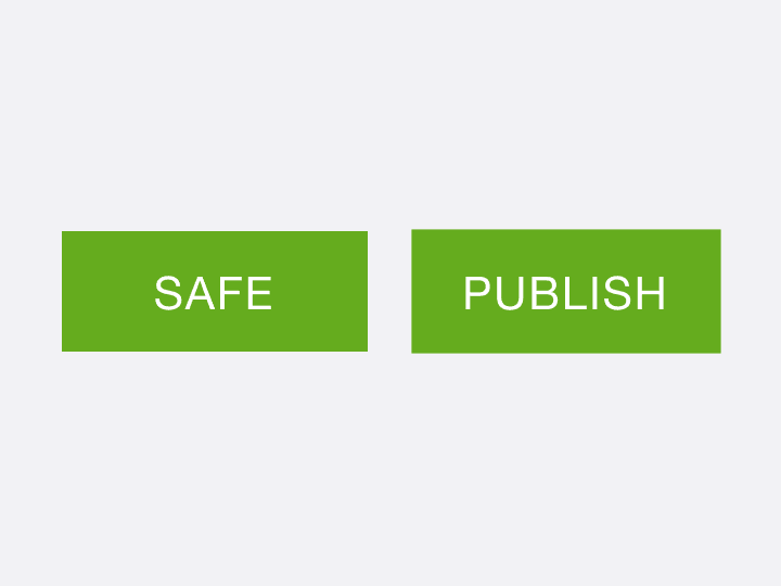
If multiple buttons are used, use two buttons with different importance and hierarchy next to each other
Labeling
For optimal use of buttons, special attention should be paid to labeling in addition to placement and hierarchy. In general, the language used should be kept simple: Users should understand immediately what it is when they read it.
Therefore, the following applies: avoid unnecessarily complicated words, keep it short and concise. The optimal verbal anatomy of a button consists of one to four words. The button label usually begins with a verb, which is supplemented by another one to three additional words that describe what happens when the button is pressed. The goal is, to provide a clear call to action. Optimal examples of button-labels are:
‘Add a comment’, ‘Download free toolkit’, ‘Get started’ or "Start"
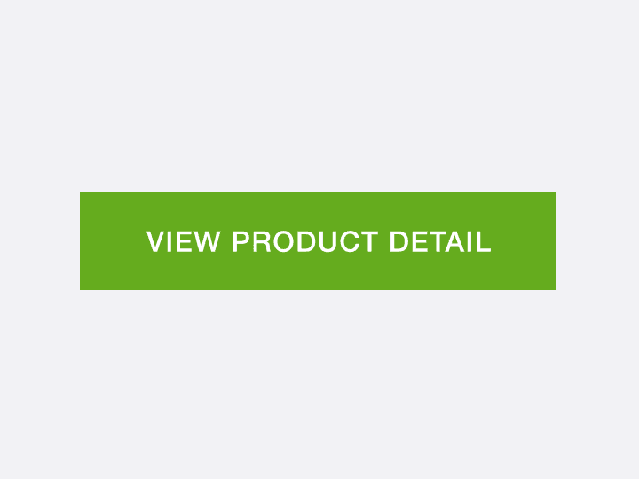
Keep the button-label concise, use a maximum of four words

Unnecessary long wordings on the button-label
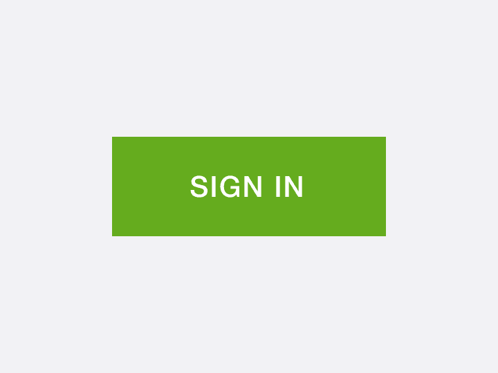
Use simple, plain language, that is easy to understand

Don't use complicated or exotic wordings
Examples
Here are some positive examples of the use of buttons in the digital BASF agricultural area: