Checkbox
A checkbox is a graphical user interface element used in web design to allow users to select one or more options from a set of choices.
Structure
Checkboxes are typically represented as a small square box that can be checked or unchecked, combined with a label.
States
The checkbox can appear in various states, which are described as follows:
Unchecked:
Border: 2px, dark grey (#7C7C7C)
Fill: white (#FFFFFF)
Icon: none
Opacity: 100%
Checked:
Fill: light green (#65AC1E)
Icon: checkmark
Opacity: 100%
Unchecked, disabled:
Border: 2px, dark grey (#7C7C7C)
Fill: white (#FFFFFF)
Opacity: 40%
Checked, disabled:
Fill: light green (#65AC1E)
Icon: checkmark
Opacity: 40%
Use case
The main purposes and use cases for checkboxes include:
Allowing multiple selections: This is useful for scenarios like selecting preferences, choosing multiple items from a list, or indicating agreement with multiple terms and conditions.
Collecting user input: Checkboxes are commonly used in forms, surveys, and settings menus to gather user input or preferences.
Toggling options on or off: Checkboxes can be used as toggles, enabling users to easily switch specific options or settings on or off with a single click or tap.
Filtering or refining search results: On e-commerce websites or search engines, checkboxes are often used to filter or refine search results based on various criteria, such as product categories, price ranges, or features.
Best practice
Providing clear and concise labels for checkboxes, logical grouping and ordering of options, and sufficient spacing and contrast for easy selection is recommended to improve usability and accessibility.
Checkboxes are often used in conjunction with other form elements such as text entry, dropdown lists or radio buttons when collecting more complex data.
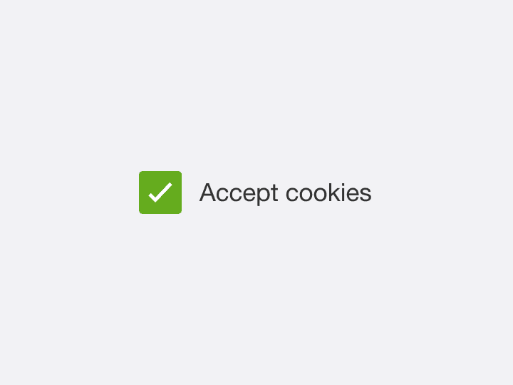
Clear, concise labels
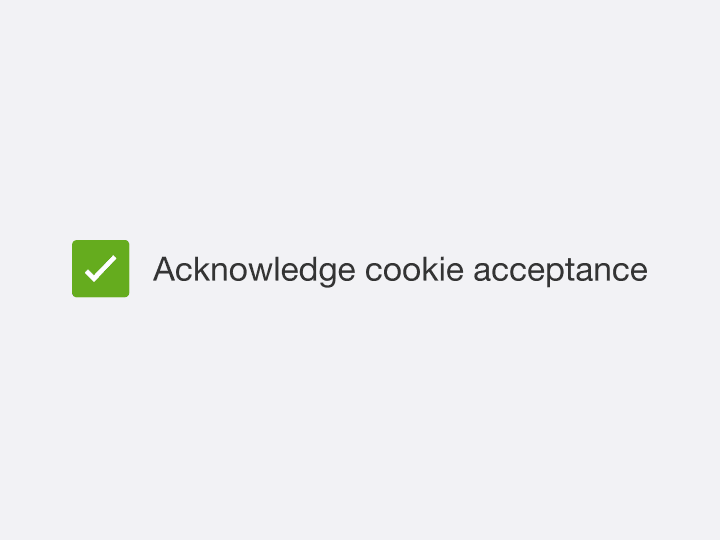
Unclear, long labels